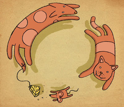
 Hello, here's a new drawing for Illustration Friday's theme, Instinct. It sometimes takes me a few days to think of an idea I'm happy with before I start drawing but this week's theme made me think of this design pretty much instantly. I think it's something to do with all the media attention surrounding the Darwin anniversary recently.
This is the original sketch -
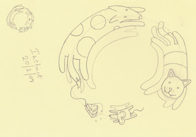 I drew a quick thumbnail sketch in the corner to work out the composition before drawing a larger version. I don't really worry about rubbing lines out as these can always be erased on the computer later. The sketch is then scanned in at 300 dpi and imported into Photoshop.
I crop it to size and then adjust the threshold (image>adjustments>threshold) to strengthen the pencil lines. This is the part where I erase/tweak any lines I'm not happy with.
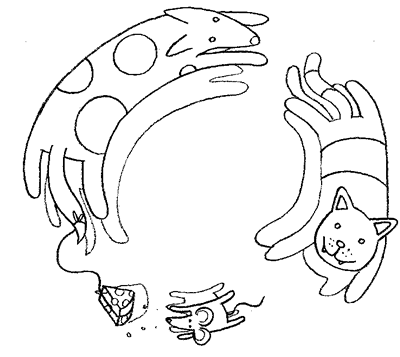 The layer containing the drawing is then turned to 'Multiply' in the layer options so it becomes transparent. I then add several layers of colour underneath. One thing I've learnt since doing more drawing for Illustration Friday is that when is comes to colour, a limited palette is often better and helps retain a consistency to the image.
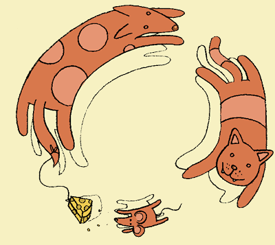 I keep the different colours in seperate layers so the hue/contrast/transparency options can be changed easily if needed. The shadows are then filled in and the pencil lines I've used as a guide are erased. I've also added an inner-shadow to help lift the animals off the page.
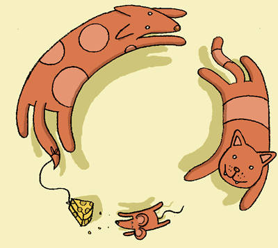 Finally, a texture of rough paper is added to a layer above the shadows but below the animals and set to 'Multiply'. Overall, this took me around an hour.


9 comments:
Nice - and it's always good to see how it was done.
I like especially the design!
What a lovely little piece!
Very funny!
Very nice and great concept!
I love the face of the cat, very funny
:-)
Very cool. Nice idea, and I dig the overhead view.
Looks great! With regard to the limited color palette, I completely agree. It really helps "control" the image. It's really nice to see the breakdown of your process. I love seeing the methods other artists use when they're working.
brilliant illo Tom… and great tutorial to boot… thanks!
Brilliant digital illustration, wish I knew how to use photoshop ;-((
Post a Comment